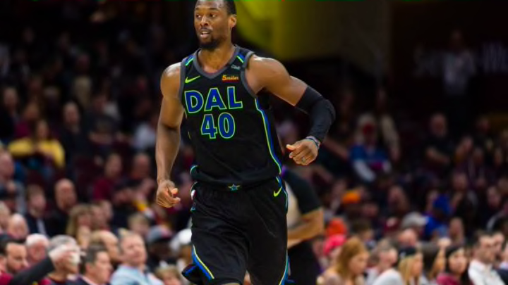
Before the Dallas Mavericks new season begins, here’s a look back at some of their recent uniforms, and why it may be the right time for a uniform redesign.
It’s time for a change. The Dallas Mavericks have tweaked their logos and uniforms here and there for the last few years, but overall, the theme has remained the same. As Dirk Nowitzki passes the torch to Luka Doncic and Dennis Smith Jr., it’s time for a complete overhaul of the team’s logo and uniforms.
I’ll leave the logo for another day. In this post, the focus will be on the uniforms. The Mavs’ uniforms aren’t bad, but they’re not in the top-tier across the league. The Mavs have had some new jerseys in the last few years, but none of them are good enough. They are all essentially tweaks on the Mavs’ current scheme, adding advertising, or, in the case of the City Jerseys, heinous fashion crimes.
Let’s take a look at some of the Mavs’ recent uniforms, as well as look back at some classics.

City Jerseys
Look, a lot of y’all like these and I don’t know why. I guess the neon green and the blue are supposed to call back to the Dallas skyline. I’m not sure. I like the black in the jersey, but “DAL” kills me. “DFW” would fit just as well and makes more sense.
The neon green just doesn’t work for me. If the NBA does this again, they better redesign these jerseys. I’d like to see something more classic or a design that better represents the Dallas area.

Dallas Skyline Jersey
When fans first heard about this idea, they were excited. I wouldn’t say the Dallas Skyline is iconic, but it is recognizable. It’s something you love seeing as you drive in from out-of-town.
However, the skyline jersey is a perfect example of a good idea with bad execution. The skyline graphic isn’t bold enough and the “Dallas” ribbon across the front is awkward.
A redesign of this uniform would be great. I’d like to see the Dallas skyline made more prominent and a different shade of blue. A blue similar to our next jersey would be fantastic.

The Royal Blue
I miss the royal blue jerseys, but it might just be nostalgia from 2011. Really, though, the color pops on these and I love the way they stand out. If these exact jerseys aren’t brought back, I’d like to at least see the royal blue color back. It’s the only jersey the Mavericks have won a championship in, after all.

The Diddy Jersey
The gold standard. I don’t know why the Diddy jersey (designed by Sean Combs) went away, or if it will ever come back. I don’t even know if I’d like it as the Mavs’ standard uniform. But I’d like to give it a try. And, at the very least, it should be an alternate jersey that’s used fairly often during the season.
The green and blue are different from every other uniform in the league. It’s the perfect combination of modern and old school.
Conclusions
To recap, burn the City Jerseys and let them never be seen again. Redesign the Dallas Skyline jersey. Bring some color back and incorporate royal blue again. And please, please, please–bring back the Diddy jerseys.
Let us know your favorite Dallas Mavericks jersey in the comments section below.
